GDP Components
In this section we will conduct an analysis to see the development of GDP components over time between countries. We will also compare how much each component contributes to country’s GDP.
Loading the data
The file we will work with is GDP and its breakdown at constant 2010
prices in US Dollars.
Let’s have look at the dataset to see how it is structured and organised
using read_excel function:
UN_GDP_data  <-  read_excel(here::here("data", "Download-GDPconstant-USD-countries.xls"),
                sheet="Download-GDPconstant-USD-countr",
                skip=2)
The data provided is in wide format. Therefore, we need to make it tidy by pivoting longer.
tidy_GDP_data <- UN_GDP_data %>%
  pivot_longer(cols=4:51,
               names_to = "Year",
               values_to = "value")
glimpse(tidy_GDP_data)
## Rows: 176,880
## Columns: 5
## $ CountryID <dbl> 4, 4, 4, 4, 4, 4, 4, 4, 4, 4, 4, 4, 4, 4, 4, 4, 4, 4, 4,…
## $ Country <chr> "Afghanistan", "Afghanistan", "Afghanistan", "Afghanista…
## $ IndicatorName <chr> "Final consumption expenditure", "Final consumption expe…
## $ Year <chr> "1970", "1971", "1972", "1973", "1974", "1975", "1976", …
## $ value <dbl> 5.56e+09, 5.33e+09, 5.20e+09, 5.75e+09, 6.15e+09, 6.32e+…Components of GDP over time
Let’s compare GDP components between 3 countries that we are interested
in. To do this, we are creating a vector with chosen countries. Further,
we mutate the value by dividing them by 1e9 so that the figures are
expressed in billions.
country_list <- c("United States","India", "Germany")
tidy_GDP_data<-tidy_GDP_data %>%
  filter(Country==country_list) %>%
  mutate(value=value/10^9)
Further, we need to change indicator names to make my graph more
understandable. We should also change variable Year for integer and
omit missing values before we start plotting.
tidy_GDP_for_graph1 <- tidy_GDP_data %>%
  mutate(components_of_GDP=case_when(
    grepl("Exports",IndicatorName) ~ "Exports",
    grepl("Gross capital formation",IndicatorName) ~ "Gross capital formation",
    grepl("Government",IndicatorName) ~ "Government expenditure",
    grepl("government",IndicatorName) ~ "Government expenditure",
    grepl("Household",IndicatorName) ~ "Household expenditure",
    grepl("household",IndicatorName) ~ "Household expenditure",
    grepl("Imports",IndicatorName)~"Imports"
  )) %>%
  mutate(Year = as.integer(Year)) %>%
  na.omit(components_of_GDP)
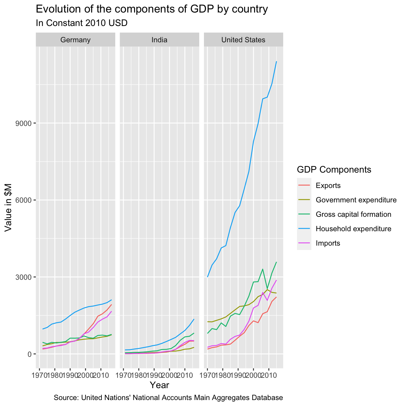
Now we can start plotting our graph of evolution of the components of GDP in Germany, India and United States.
ggplot(tidy_GDP_for_graph1,
       aes(x=Year,y=value,color=components_of_GDP))+
  geom_line(aes(group=components_of_GDP))+
  facet_wrap(~Country)+
  labs(
    title = "Evolution of the components of GDP by country",
    subtitle = "In Constant 2010 USD",
    caption = "Source: United Nations' National Accounts Main Aggregates Database",
    color = "GDP Components",
    x = "Year",
    y = "Value in $M"
  )
GDP as sum of components
As mentioned above, GDP is the sum of Household Expenditure (Consumption
C), Gross Capital Formation (business investment I), Government
Expenditure (G) and Net Exports (exports - imports). Even though there
is an indicator Gross Domestic Product (GDP) in your dataframe, let’s
calculate it given its components discussed above.
First, we need to pivot out table wider to calculate GDP as sum of its
components, we will call it wider_gdp. Than, we will use left_join
function to connect the tables by country and year and to see the
percentage comparison.
tidy_GDP_for_graph1 %>%
  select(Country, components_of_GDP, Year, value) %>%
  pivot_wider(names_from = components_of_GDP, values_from = value) %>%
  janitor::clean_names() %>%
  mutate(
    net_exports = exports - imports,
    gdp = household_expenditure + government_expenditure + gross_capital_formation + net_exports
    ) -> wider_gdp

wider_gdp %>%
  select(country, year, gdp)
## # A tibble: 48 × 3
## country year gdp
## <chr> <int> <dbl>
## 1 Germany 1972 1709.
## 2 Germany 1975 1780.
## 3 Germany 1978 1991.
## 4 Germany 1981 2091.
## 5 Germany 1984 2158.
## 6 Germany 1987 2303.
## 7 Germany 1990 2591.
## 8 Germany 1993 2748.
## 9 Germany 1996 2887.
## 10 Germany 1999 3053.
## # … with 38 more rows
## # ℹ Use `print(n = ...)` to see more rowstidy_GDP_data_for_join = tidy_GDP_data%>%
filter(IndicatorName=="Gross Domestic Product (GDP)") %>%
mutate(Year=as.integer(Year)) %>%
select(Country,Year,value)
tidy_GDP_data_comparison=left_join(wider_gdp,tidy_GDP_data_for_join,by=c("country"="Country","year"="Year"))
tidy_GDP_data_comparison %>%
mutate(percentage_change=(value-gdp)/value) %>%
select(country,year,gdp,value,percentage_change)## # A tibble: 48 × 5
## country year gdp value percentage_change
## <chr> <int> <dbl> <dbl> <dbl>
## 1 Germany 1972 1709. 1650. -0.0356
## 2 Germany 1975 1780. 1729. -0.0293
## 3 Germany 1978 1991. 1932. -0.0305
## 4 Germany 1981 2091. 2051. -0.0192
## 5 Germany 1984 2158. 2134. -0.0114
## 6 Germany 1987 2303. 2265. -0.0168
## 7 Germany 1990 2591. 2569. -0.00877
## 8 Germany 1993 2748. 2725. -0.00811
## 9 Germany 1996 2887. 2864. -0.00787
## 10 Germany 1999 3053. 3034. -0.00613
## # … with 38 more rows
## # ℹ Use `print(n = ...)` to see more rowsAbove in the table we may see that there are some minor differences between what we calculated as GDP and the GDP figure included in the dataset.
Components expressed in percentage of GDP
Let’s see what was the dynamic of GDP and its components in percentage of GDP between the countries we chosen previously.
wider_gdp %>%
  mutate(
    percentage_GE = 100*government_expenditure/gdp,
    percentage_GCF = 100*gross_capital_formation/gdp,
    percentage_HE = 100*household_expenditure/gdp,
    percentage_NE = 100*net_exports/gdp
  ) %>%
  select(country, year, percentage_GE, percentage_GCF, percentage_HE, percentage_NE) %>%
  pivot_longer(cols = 3:6, names_to = "component_of_gdp", values_to = "value") %>%
  ggplot(aes(x=year, y=value, color=component_of_gdp)) +
    geom_line() +
    facet_wrap(~country) +
    theme_minimal() +
    labs(
      title = "GDP and its breakdown at constant 2010 prices in US Dollars",
      x = NULL,
      y = "% of GDP",
      caption = "Source: United Nations",
      color = NULL
    ) +
    scale_color_hue(
      labels = c('Gross Capital Formation',
                 'Government Expenditure',
                 'Household Expenditure',
                 'Net Exports'
                 )
      )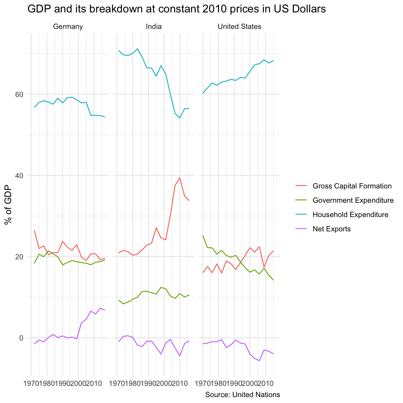
For all three countries household expenditure is the biggest contributor to the GDP, followed by gross capital formation, government expenditure, and finally Net Exports.
The graph clearly shows that Germany is an exporting country, whereas the US seems to import more than it exports, and India seems to fluctuate close to zero.
Between the three countries, India experiences the highest variability in GDP components, with Gross Capital Formation increasing greatly, and household expenditure decreasing greatly. In the United States, gross capital formation and government expenditure contributed roughly the same amount, with gross capital formation briefly increasing to more than government expenditure, before dipping back down to less than government expenditure.
GDP breakdown comparison
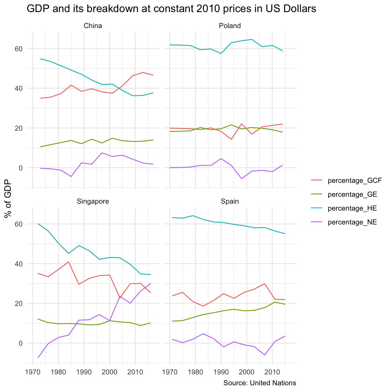
Finally, let’s plot a graph showing a dynamic of GDP and its components between Poland, Spain, Singapore and China over given time period.
country_list <- c("Poland","Spain", "Singapore", "China")

tidy_GDP_data <- UN_GDP_data %>%
  pivot_longer(cols=4:51,
               names_to = "Year",
               values_to = "value")

tidy_GDP_data<-tidy_GDP_data %>%
  filter(Country==country_list) %>%
  mutate(value=value/10^9)

tidy_GDP_for_graph1 <- tidy_GDP_data %>%
  mutate(components_of_GDP=case_when(
    grepl("Exports",IndicatorName) ~ "Exports",
    grepl("Gross capital formation",IndicatorName) ~ "Gross capital formation",
    grepl("Government",IndicatorName) ~ "Government expenditure",
    grepl("government",IndicatorName) ~ "Government expenditure",
    grepl("Household",IndicatorName) ~ "Household expenditure",
    grepl("household",IndicatorName) ~ "Household expenditure",
    grepl("Imports",IndicatorName)~"Imports"
  )) %>%
  mutate(Year = as.integer(Year)) %>%
  na.omit(components_of_GDP)

tidy_GDP_for_graph1 %>%
  select(Country, components_of_GDP, Year, value) %>%
  pivot_wider(names_from = components_of_GDP, values_from = value) %>%
  janitor::clean_names() %>%
  mutate(
    net_exports = exports - imports,
    gdp = household_expenditure + government_expenditure + gross_capital_formation + net_exports
    ) -> wider_gdp

wider_gdp %>%
  mutate(
    percentage_GE = 100*government_expenditure/gdp,
    percentage_GCF = 100*gross_capital_formation/gdp,
    percentage_HE = 100*household_expenditure/gdp,
    percentage_NE = 100*net_exports/gdp
  ) %>%
  select(country, year, percentage_GE, percentage_GCF, percentage_HE, percentage_NE) %>%
  pivot_longer(cols = 3:6, names_to = "component_of_gdp", values_to = "value") %>%
  ggplot(aes(x=year, y=value, color=component_of_gdp)) +
    geom_line() +
    facet_wrap(~country) +
    theme_minimal() +
    labs(
      title = "GDP and its breakdown at constant 2010 prices in US Dollars",
      x = NULL,
      y = "% of GDP",
      caption = "Source: United Nations",
      color = NULL
    ) +
    scale_fill_discrete(
      labels = c('Gross Capital Formation',
                 'Government Expenditure',
                 'Household Expenditure',
                 'Net Exports'
                 )
      )