Renewable energy production

In this section we will investigate the data on energy production between countries in order to identify pioneers in renewable energy production. We will also explore the relationship between ratio of renewable energy production to total energy production and CO2 emissions.
Loading the data
To prepare our dataset, we need to load it using read_csv, get country
names using countrycode package and drop unwanted variables. At the
end we are getting all data that we need: the region a country is in and
its income level.
technology <- readr::read_csv('https://raw.githubusercontent.com/rfordatascience/tidytuesday/master/data/2022/2022-07-19/technology.csv')

labels <- technology %>%
  distinct(variable, label)

technology <- technology %>%
  filter(iso3c != "XCD") %>%
  mutate(iso3c = recode(iso3c, "ROM" = "ROU"),
         country = countrycode(iso3c, origin = "iso3c", destination = "country.name"),
         country = case_when(
           iso3c == "ANT" ~ "Netherlands Antilles",
           iso3c == "CSK" ~ "Czechoslovakia",
           iso3c == "XKX" ~ "Kosovo",
           TRUE           ~ country))

energy <- technology %>%
  filter(category == "Energy")

# download CO2 per capita from World Bank using {wbstats} package
# https://data.worldbank.org/indicator/EN.ATM.CO2E.PC
co2_percap <- wb_data(country = "countries_only",
                      indicator = "EN.ATM.CO2E.PC",
                      start_date = 1970,
                      end_date = 2022,
                      return_wide=FALSE) %>%
  filter(!is.na(value)) %>%

  select(-c(unit, obs_status, footnote, last_updated))

countries <-  wb_cachelist$countries %>%
  select(iso3c,region,income_level)
Percentage of renewable energy production
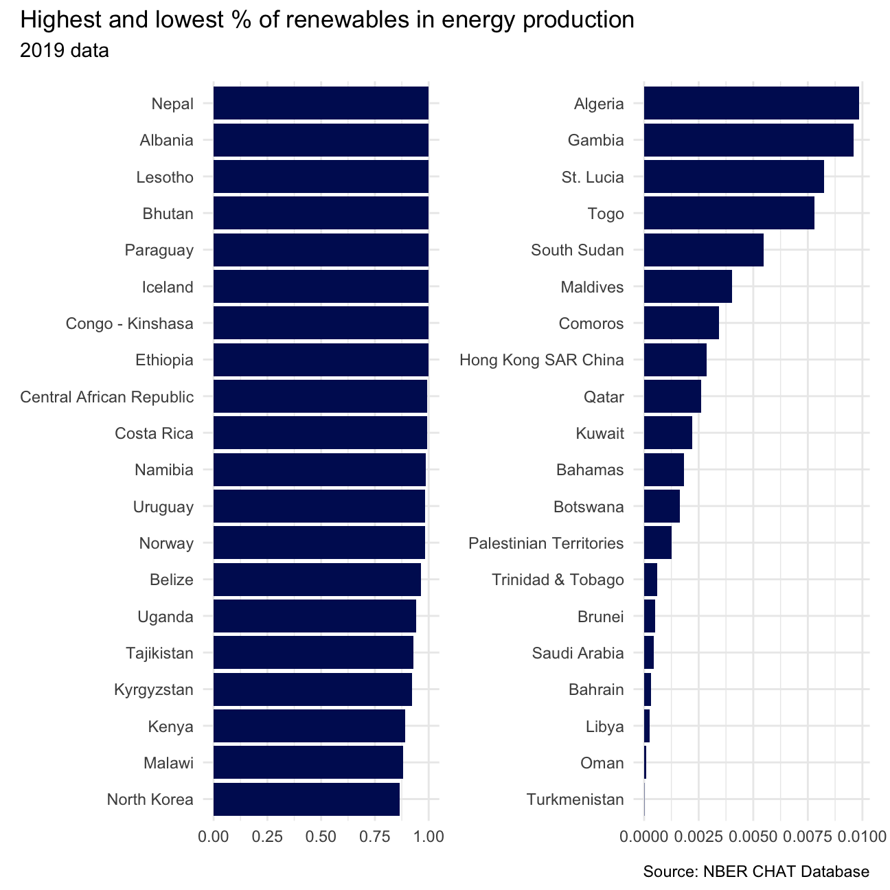
Let’s plot two graphs, showing us the 20 countries with highest and lowest percentage of renewals in energy production in 2019. We need to start with pivoting our table wider, to get the sum of all renewable energy sources and than divide it by total energy produced by the country.
After plotting both graphs with top and bottom performers, we can
combine them with patchwork.
energy %>%
  select(-iso3c, -label, -category, -group) %>%
  pivot_wider(names_from = variable, values_from = value) %>%
  mutate(prop_renewable = (
    elec_hydro+elec_solar+elec_wind+elec_renew_other)/elecprod
    ) -> energy_pv

library(patchwork)

plot_1 <- energy_pv %>%
  filter(year==2019) %>%
  slice_max(n=20, prop_renewable) %>%
  mutate(country = fct_reorder(country,prop_renewable)) %>%
  ggplot(aes(x=country, y=prop_renewable)) +
  geom_col(fill="#001461") +
  coord_flip() +
  labs(x=NULL,y=NULL) +
  theme_minimal()

plot_2 <- energy_pv %>%
  filter(year==2019, prop_renewable != 0) %>%
  slice_min(n=20, prop_renewable) %>%
  mutate(country = fct_reorder(country,prop_renewable)) %>%
  ggplot(aes(x=country, y=prop_renewable)) +
  geom_col(fill="#001461") +
  coord_flip() +
  labs(x=NULL,y=NULL) +
  theme_minimal()

patchwork::wrap_plots(plot_1 + plot_2) +
  plot_annotation(
    title="Highest and lowest % of renewables in energy production",
    subtitle="2019 data",
    caption="Source: NBER CHAT Database"
  )
Relationship between percentage of renewables and CO2 per capita emissions
Further we can explore what is the relationship between the percentage
of energy generated by renewables and CO2 per capita emissions. In order
to investigate this relationship we will produce an animation showing us
how does CO2 per capita emissions react for the change in % of the
energy generated by renewables over time. First, let’s prepare the data
before we can plot a graph. all_elec_data contains all columns that we
need to our animation and omits missing values.
Than we are able to plot our animation by creating a ggplot and
faceting by income level. Adding transition_time(Year) we can produce
an animation to follow the relationship between two variables over time.
energy %>%
  select(-label, -category, -group) %>%
  pivot_wider(names_from = variable, values_from = value) %>%
  mutate(prop_renewable = (
    elec_hydro+elec_solar+elec_wind+elec_renew_other)/elecprod
    ) %>%
  select(iso3c, country, year, prop_renewable) %>%
  left_join(countries, by="iso3c") %>%
  left_join(
    co2_percap %>% select(iso3c, date, value),
    by=c("iso3c" = "iso3c", "year" = "date")
  ) %>%
  na.omit() -> all_elec_data

all_elec_data %>%
  ggplot(aes(x=prop_renewable, y=value)) +
  geom_point(aes(color=income_level)) +
  facet_wrap(~income_level) +
  labs(
    title="Year: {as.integer(frame_time)}",
    x = "% renewables",
    y = "CO2 per cap"
  ) +
  theme_minimal() +
  theme(legend.position = "none") +
  transition_time(year) +
  view_follow(fixed_y = TRUE) +
  ease_aes('linear') -> anim_plot

animate(anim_plot)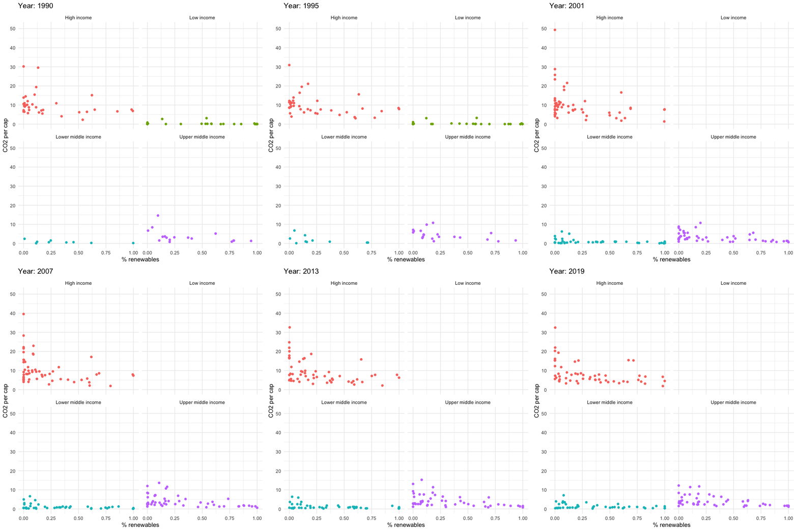
Looking at this visualisation it seems there is no correlation between two variables. The CO2 per capita does not seem to go down as the percentage of renewables go up. For most of the countries the CO2 per capita stays the same, while % of renewables change. However, it is difficult to determine if the statement is true or false just looking at the animation without running proper tests.