Climate change and temperature anomalies

In this section I will conduct an analysis of weather anomalies between 1880 - 2022. The data used in this analysis has been collected by NASA’s Goddard Institute for Space Studies.
Loading the data
Let’s have a quick look at the data provided by NASA.
weather <-
  read_csv("https://data.giss.nasa.gov/gistemp/tabledata_v4/NH.Ts+dSST.csv",
           skip = 1,
           na = "***")

head(weather)
## # A tibble: 6 × 19
## Year Jan Feb Mar Apr May Jun Jul Aug Sep Oct Nov Dec
## <dbl> <dbl> <dbl> <dbl> <dbl> <dbl> <dbl> <dbl> <dbl> <dbl> <dbl> <dbl> <dbl>
## 1 1880 -0.39 -0.53 -0.23 -0.3 -0.05 -0.18 -0.21 -0.25 -0.24 -0.3 -0.43 -0.42
## 2 1881 -0.3 -0.24 -0.05 -0.02 0.05 -0.33 0.1 -0.04 -0.28 -0.44 -0.36 -0.23
## 3 1882 0.26 0.21 0.02 -0.3 -0.23 -0.28 -0.28 -0.14 -0.24 -0.51 -0.33 -0.68
## 4 1883 -0.58 -0.66 -0.15 -0.3 -0.25 -0.11 -0.05 -0.22 -0.34 -0.16 -0.44 -0.15
## 5 1884 -0.16 -0.11 -0.64 -0.59 -0.36 -0.41 -0.41 -0.51 -0.45 -0.44 -0.57 -0.47
## 6 1885 -1.01 -0.45 -0.23 -0.49 -0.58 -0.45 -0.34 -0.41 -0.4 -0.37 -0.38 -0.11
## # … with 6 more variables: `J-D` <dbl>, `D-N` <dbl>, DJF <dbl>, MAM <dbl>,
## # JJA <dbl>, SON <dbl>
## # ℹ Use `colnames()` to see all variable namesThe data gives us the information on the deviation of the temperature from expected temperature for every month and year between 1880 and 2021.
Time-series scatter plot
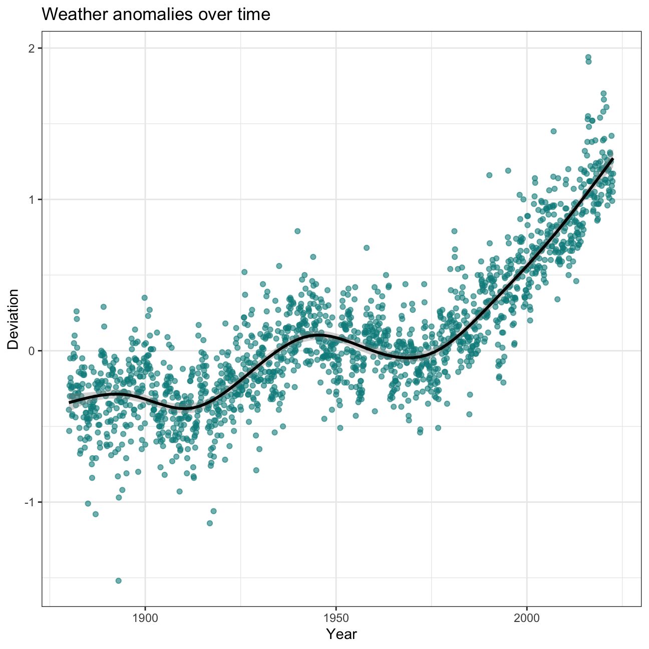
Let’s see what was the dynamic of weather anomalies over years. In order
to create a scatter plot, I need to pivot the table using function
pivot_longer.
weather %>%
  select(1:13) %>%
  pivot_longer(2:13, names_to = "month", values_to = "delta") -> tidyweather
Now, after creating a new variable date, I am able to produce
time-series scatter plot showing a pace of weather anomalies over time.
tidyweather <- tidyweather %>%
  mutate(date = ymd(paste(as.character(Year), month, "1")),
         month = month(date, label=TRUE),
         Year = year(date))

ggplot(tidyweather, aes(x=date, y = delta))+
  geom_point(color = "darkcyan", alpha = 0.6)+
  geom_smooth(color="black") +
  theme_bw() +
  labs (
    title = "Weather anomalies over time",
    x = "Year",
    y = "Deviation"
  )
Let’s have a look at the weather anomalies each month by using
facet_wrap function.
ggplot(tidyweather, aes(x=date, y = delta))+
  geom_point(color = "darkcyan", alpha = 0.6)+
  geom_smooth(color="black") +
  facet_wrap(~month) +
  theme_bw() +
  labs (
    title = "Weather Anomalies",
    x = "Year",
    y = "Deviation"
  )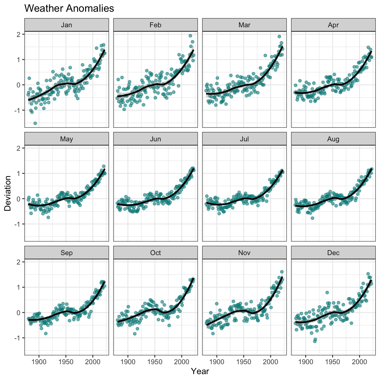
There is no apparent difference between the effects of increasing temperature in monthly data. January and February seem to represent the strongest change over time, but it does not vary significantly from other months. Therefore, we can conclude that the climate change influences deviations in temperature regardless of the month or season.
Density plot of weather anomalies
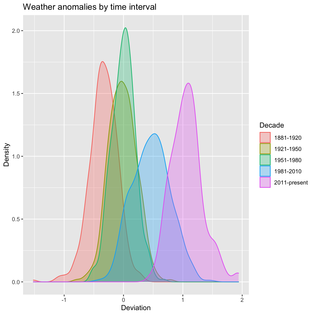
Now, let’s produce a density plot of weather anomalies for 5 time
periods starting from 1880. In order to do this, I need to create new
variable interval using mutate function.
comparison <- tidyweather %>%
  filter(Year>= 1881) %>%
  mutate(interval = case_when(
    Year %in% c(1881:1920) ~ "1881-1920",
    Year %in% c(1921:1950) ~ "1921-1950",
    Year %in% c(1951:1980) ~ "1951-1980",
    Year %in% c(1981:2010) ~ "1981-2010",
    TRUE ~ "2011-present"
  ))
In a next step, I am plotting the graph with ggplot package.
comparison %>%
  ggplot(aes(x = delta, fill = interval, color = interval)) +
  geom_density(alpha = 0.3) +
  labs (
    title = "Weather anomalies by time interval ",
    x = "Deviation",
    y = "Density",
    fill = "Decade",
    color = "Decade"
  )
Average annual anomalies
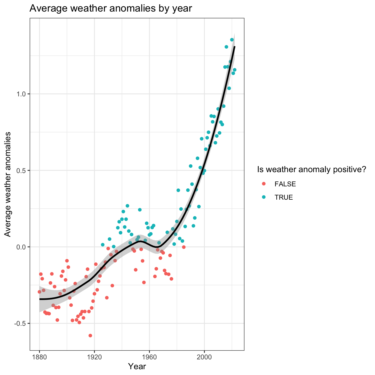
We can also create a plot for average yearly anomalies. To produce this
graph, I need to create yearly averages using group_by and summarise
functions. I am using loess method to see the trend over time.
average_annual_anomaly <- tidyweather %>%
  group_by(Year) %>%
  summarise(mean_delta = mean(delta, na.rm=TRUE))

average_annual_anomaly %>%
  ggplot(aes(x=Year, y=mean_delta)) +
  geom_point(aes(color=mean_delta>0)) + # DRAWING POINTS ABOVE ZERO A DIFFERENT COLOUR
  geom_smooth(method = "loess", color="black") +
  theme_bw() +
  labs(
    title = "Average weather anomalies by year",
    x = "Year",
    y = "Average weather anomalies",
    color = "Is weather anomaly positive?"
  )
Confidence Interval for delta
Let’s construct confidence interval for weather anomalies since 2011. First, I will try calculating CI using formula.
CI using formula
For starters, I filtered for years 2011 and above. In order to calculate
the confidence intervals, I have calculated for every year many summary
statistics including mean, SD, SE and sample size. Using these summary
statistics I have calculated the t-Student distribution critical value,
and multiplied the t_critical by the standard error to get the final
margin of error. Finally I added and subtracted the margin of error to
the mean to get the limits of the interval.
formula_ci <- comparison %>%
  filter(Year >= 2011) %>%
  group_by(Year) %>%
  summarise(
    mean_delta = mean(delta),
    sd_delta = sd(delta),
    count = n(),
    # We're choosing a 95% confidence interval:
    t_critical = qt(0.975, count-1),
    se_delta = sd(delta/sqrt(count)),
    margin_of_error = t_critical*se_delta,
    delta_low  = mean_delta - margin_of_error,
    delta_high = mean_delta + margin_of_error
  )

formula_ci
## # A tibble: 12 × 9
## Year mean_delta sd_delta count t_critical se_delta margin_…¹ delta…² delta…³
## <dbl> <dbl> <dbl> <int> <dbl> <dbl> <dbl> <dbl> <dbl>
## 1 2011 0.745 0.113 12 2.20 0.0327 0.0720 0.673 0.817
## 2 2012 0.815 0.179 12 2.20 0.0517 0.114 0.701 0.929
## 3 2013 0.8 0.118 12 2.20 0.0340 0.0749 0.725 0.875
## 4 2014 0.92 0.145 12 2.20 0.0420 0.0924 0.828 1.01
## 5 2015 1.18 0.178 12 2.20 0.0515 0.113 1.06 1.29
## 6 2016 1.31 0.333 12 2.20 0.0961 0.212 1.10 1.52
## 7 2017 1.18 0.226 12 2.20 0.0653 0.144 1.03 1.32
## 8 2018 1.04 0.137 12 2.20 0.0396 0.0871 0.950 1.12
## 9 2019 1.21 0.153 12 2.20 0.0441 0.0970 1.11 1.31
## 10 2020 1.35 0.225 12 2.20 0.0648 0.143 1.21 1.50
## 11 2021 1.14 0.117 12 2.20 0.0339 0.0746 1.06 1.21
## 12 2022 NA NA 12 2.20 NA NA NA NA
## # … with abbreviated variable names ¹margin_of_error, ²delta_low, ³delta_highIn order to fully understand the data we I calculated above, here you can see the following visualization of the mean and confidence intervals:
formula_ci %>%
  mutate(Year = as.factor(Year)) %>%
  na.omit() %>%
  ggplot(aes(color = Year)) +
  geom_pointrange(aes(x=Year, y=mean_delta, ymax=delta_high, ymin=delta_low)) +
  theme_bw() +
  theme(legend.position = "none") +
  labs(
    title = "Weather anomalies range by Year",
    subtitle = "NASA Weater Data",
    x = "Year",
    y = "Delta range",
    color = NULL
  )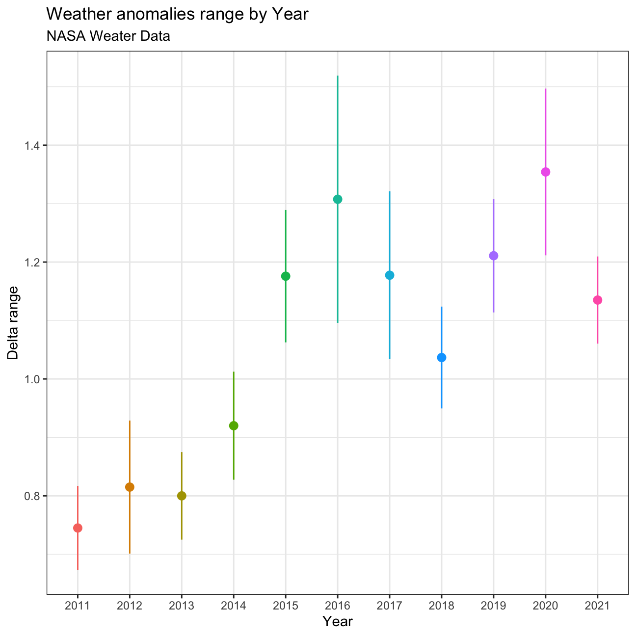
The visualization shows an increase in the mean over the years, reaching a first maximum in 2016, and an even higher maximum mean in 2020. For years with a higher mean delta, the confidence intervals seem to increase as well. With the current samples and intervals, we cannot say for sure that the mean delta in year 2016 was higher than the mean delta in 2017 for instance, but we can be sure with 95% confidence that 2011 was lower than 2016.
CI using formula (for all years)
Since there are not enough data points every year, the confidence intervals are very large and vary a lot by year. The total confidence interval for the entire period is as follows:
formula_ci_interval <- comparison %>%

  filter(Year >= 2011) %>%
  na.omit() %>%
  group_by(interval) %>%
  summarise(
    mean_delta = mean(delta),
    sd_delta = sd(delta),
    count = n(),
    t_critical = qt(0.975, count-1),
    se_delta = sd(delta/sqrt(count)),
    margin_of_error = t_critical*se_delta,
    delta_low  = mean_delta - margin_of_error,
    delta_high = mean_delta + margin_of_error
  )

formula_ci_interval %>% select(delta_low, delta_high)
## # A tibble: 1 × 2
## delta_low delta_high
## <dbl> <dbl>
## 1 1.02 1.11CI using bootstrapping
Finally, we can also calculate the intervals for year 2011 and above
using bootstraping:
boot_dist <- comparison %>%
  filter(Year >= 2011) %>%
  mutate(Year = as.factor(Year)) %>%
  specify(response=delta) %>%
  generate(reps=1000, type="bootstrap") %>%
  calculate(stat = "mean")

boot_dist %>%
  get_confidence_interval(
    level = 0.95
  )
## # A tibble: 1 × 2
## lower_ci upper_ci
## <dbl> <dbl>
## 1 1.02 1.11